ShopDreamUp AI ArtDreamUp
Deviation Actions


Suggested Deviants


Suggested Collections


You Might Like…


Featured in Groups


Description
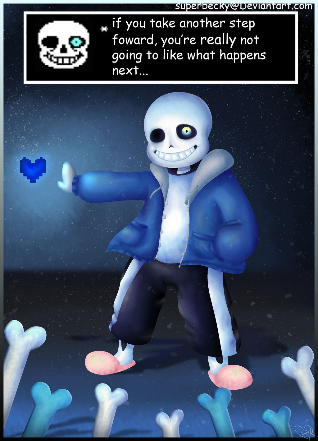
 Well buddy, your really not going to like what happens next...
*takes another step*
 Oh, well uh, shoot I didnt know you were serious like damn ok lets do this...
------------------------------------------------------------------------------------------------------------------
IT TOOK SO LOOONGGG TO FINISH THIS UGH-
Howdy everyone XD
So I have been wanting to attempt to do a more 3d looking piece. I hope that it turned out ok. Well, whether or not it did I am still proud of it overall. Well, I dont like the lighting very much but I dont know how to do good lighting yet BUT WHATEVER :'D
Well, I at least had fun doing this. I am thinking of doing another ink sansy, blueberry or error. Not sure who yet though......
But uh- hope you guys like it
Comments? :3
Image size
2513x3479px 5.03 MB
© 2016 - 2024 SuperBecky
Comments14
Join the community to add your comment. Already a deviant? Log In
First of all, this caught my eye from the group stack. That's something. This piece is very fluid and has a lot of motion to it. It has the 3-D effect that your going for.
Let's start with the bad stuff. I don't like the feet/slippers thing at all. He's a skeleton, but it looks like here he just has white skin. It threw me off a little. Second, the bones in the front don't quite pop out at me as 3-D. I wish they overlapped in front of Sans a bit more, or had a more noticeable shadow. The third (and probably final) thing I don't like about this piece is the weird, foggy magic effect you did in front. It doesn't mesh well with his coat, and it draws your attention away from the important things- such as Sans's face and the soul. I think you could remove that, and this piece would be just as powerful.
Last thing! In the text box, you used the wrong "you're". Make sure to spell check!
I love this piece, I really do. But like all things, it can be improved. I hope this critique helps you!